An organized and informative website is the backbone of your success in our digital age and the portal through which your clients gain access to you and your products or services. We know that content is king and that you must make sure to keep your website relevant, fresh, and search engine optimized (SEO). You understand that you need eye-catching images and infographics, but do you realize that the fonts that you choose are important too.
If you haven’t realized it yet, using great font combinations can help you to better serve your clients and to draw in new ones for it will help potential clients understand who you are. Read more to view some of the best suggested fonts for websites. Studies and surveys have shown why choosing the right typography will go a long way in creating a website that will work for you and your clients.
What The Right Fonts Will Do for Your Website
It can seem trivial when you are talking about creating a website, but it is not. Font choices, colors, and sizes are going to do so much for your site.
The Overall Look
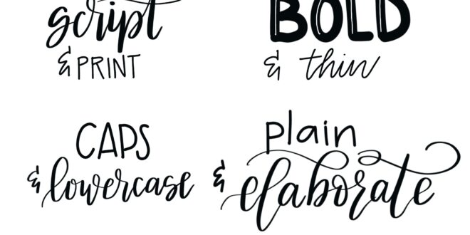
The right fonts and combination of fonts can add an amazing design element to your website. It isn’t like back in the day when you only had a couple of different fonts to choose from. There are plenty of great font families out there for you to consider using.
Take your time and explore all your choices. See how they look together and get the opinions of your target audience to see how they respond to them. There is no better advice than the advice of those whose attention you are trying to get. Check this website for more.
What Is Research Saying About Font Choices?

People researched Font choices in the past and this article will give you some idea about what is out there.
In general, font choices indicate the preferences of the type designer, where the information is often based on scientific tests and consumer feedback. On the other hand, some fonts are purely for looks. In such cases, the designer gives weight to the appearance, disregarding the importance of function or readability. Both approaches have value but although we see them as equal in some circles, individual tastes can lead to different conclusions.
It is considered more serious to use fonts with a formal look, such as Helvetica. People who read the same material in a font like that tend to believe the information more and there are fewer disagreements between them. The opposite is true for a more whimsical font, like Comic Sans.
Content Classification and Importance

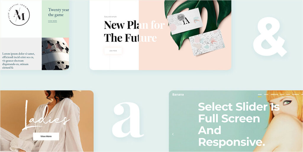
The right font, font color, and font size helps users to identify the different types of content and information on your website.
All sites are going to have three main types of content: main, secondary, and navigation, and how they differ, visually, from one another will help the user figure out your site and the content.
The main content is going to be the content that pertains to what the page is about. This is going to be the utmost important information because it helps the user to find what they are looking for. This will be the content in larger fonts to draw the user’s attention first.
Secondary content are things like tags and CTAs (call to action). As the name suggests, this is the second most important information on your site. Once a user has been through the main content, the secondary content is going to draw them deeper into the site.
Navigation content is pretty self-explanatory. This is the content that helps them to get around your site so they can find what they are looking for.
The right fonts, colors, and sizes allow users to easily differentiate between all of the different types of content that you have on your website. The differentiation in the font will help them to classify the content by importance based on the size and color of the font.
Consistency In Design

This may seem redundant to say, but you are going to want to maintain the font design across all the pages of your site. Once they have gone through the homepage and have seen how your font choices classify information, they will be able to use that information to figure out the content classification on all other pages.
It is not going to make any sense to change up the font, font size, and font color from page to page. All the pages of your website are going to be one coherent idea and your typography choices will reflect that coherence.
Lackluster choices in typography may come across as an unorganized site and, thus, an unorganized business. It’s not a good look.
The Layout

The overall layout of your website content is so important. Font, white space, images, infographics, a user’s ability to easily scan the page, dimensions, Gestalt Design Laws, spacing are all part of creating a website. All the different website design elements come together to create a website that is going to be well-viewed and draw in an audience.
There is serious science behind websites, but don’t forget the artistic part. Your website reflects your business, your brand, and what you have to offer. A well-thought-out and well put-together site is going to communicate a lot to a client.
Try to figure out how one font design is contributing to a website’s design. Are there strong, bold serifs or sans serif fonts used? Are the colors appropriate? Is the placement of the type good? Do the fonts blend well enough? How many elements are next to each other? These are all details to consider when choose fonts for a website.
Make sure that you also allow your personality to shine through as well. Just because it is a serious process, it doesn’t mean that you can’t, or shouldn’t, have fun with it too.
You want your passion for your industry to shine. That blend of science and art will show clients and potential clients that you are serious about what you love to do.