Your poster presentation ought to be visually appealing and easy to read. These two aspects form the backbone of a good poster presentation and should remain constant regardless of the subject you are presenting.
Having said that, good posters only need a minimal amount of text coupled with a few relevant images to effectively convey their message to the audience. Therefore, it is important to design a layout that follows this criterion.
To achieve that, you can take assistance from StoryboardThat to help you to create a poster template that presents your content in an organized and aesthetically pleasing manner. However, there are still some points that you need to keep in mind when designing a poster presentation.
Hence, we have devised an 8-step simple guide for you to follow and nail your presentation!
1. Prepare Your Content Material

To begin, you must first understand the topic of your presentation and collect relevant information about it from the internet.
A poster’s limited space necessitates that the information you wish to present is both thorough and succinct. Moreover, cramming long chunks of text would only affect readability and compromise the quality of your work.
Hence, compile all the text material and organize it into short paragraphs or bullet points so that you can later easily copy-paste it on your actual poster.
2. Select a Catchy Title

After you have prepared your content material, it is now time to give it an appropriate title.
Make sure you choose a title that is catchy and fully encapsulates the essence of your topic. The objective is to draw viewers’ attention while giving them an idea of what to expect from the presentation.
Also, keep in mind that there are space constraints, so keep your title short—preferably two lines or less.
3. Select Pictures

Take out pictures from the internet that best describe your content material. Since posters are a visual medium, choose pictures that will instantly grab the audience’s attention.
Make sure the images you choose have a high resolution and are large enough to be seen from a distance. Also, in order to remove the aspect of dullness and add vibrancy to your poster, it is preferable to utilize colored photographs rather than monochrome ones.
4. Choose a Template
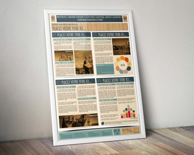
Select a ready-made template from the internet or design a layout yourself based on the information you have extracted and the pictures you wish to use in your poster.
To make it simple for the audience to browse through the poster’s content, make sure your layout does not obstruct the flow or the sequence of information that will be presented on the poster. You should never leave your viewers wondering what to read on the poster next!
To put it simply, your chosen template should be able to clearly demonstrate all of your content while also making it appear visually appealing.
5. Specify Font Style and Size
The font that you choose should be simple, prominent, and easily legible. As for the text size, it should be big enough to be easily read from a reasonable distance.
Sans Serif fonts like Arial or Calibri are generally used for posters and presentations, hence you can make use of those two typefaces as they are most easily readable.
That said, you should try to stick to one or two typefaces and make sure the headings, text in paragraphs, numbers, or figures are all consistent in their respective font style and size.
To give your poster an overall professional look, it is important that you maintain consistency in your text.
6. Decide on a Color Scheme

You can add life to your poster just by giving it an appropriate color scheme. Plus, it is also a great way to grab the viewer’s attention.
It is crucial to choose wisely what colors you want to make use of and utilize them with careful consideration as the random use of colors can bear negative consequences.
For example, it is best to limit your use of color to two or three if you want to avoid detracting the viewers from the actual content of the poster. Also, avoid placing light-colored text on a white backdrop because it will blend in with the background, making it difficult for viewers to read it.
Last but not the least, in order to cater to a wide audience, make sure you choose fewer colors that are challenging for color-blind individuals to distinguish between.
7. Paste and Proofread
Put all the text and images into the template you have chosen and proofread your material to ensure there are no mistakes.
After you have done that, adjust the font style, size, and color of the text. Since in this step, the whole presentation comes together and you can finally see your presentation as your audience would, you can pinpoint any mistakes you have made along the way.
It is essential to double-check everything as you don’t want your viewers to fixate on your mistakes and forget about what you are actually saying in your presentation.
8. Print

At last, after you have checked everything a thousand times, the only thing that will be left to do would be to hit the button and print a high-resolution poster for your presentation!
This can be deemed as the easiest step as it does not involve any decision-making, checking, or editing. You can finally relax your brain and just focus on delivering what you have prepared!
To Sum It up…
Making a perfect poster presentation can seem difficult. However, if you put in the hard work and adhere to all the instructions provided in the article, you can ace your presentation!